

The problem
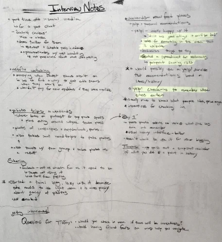
As a part of an immersive design course at General Assembly, our first project was to interview a partner and find a problem to solve in their life with an app for one. Tiffany likes to explore new places & the cuisines they offer while keeping track of where she has been and what she liked to eat. However, she sometimes forgets to check-in or review restaurants during her busy day, making it harder for her to make informed food recommendations to her friends.
Details
TEAM
I worked by myself for 1 week on $end
Tools
- Pencil & Whiteboard Sketches
- Omnigraffle
- Sketch
- InVision
ROLE
Interviews, competitive analysis, scope, sketching, usability tests, iterations, visual design.

INterview
Interview Ideation

Problem Statements
After I had gathered information about Tiffany (persona) and putting her pain points into context, I went about defining the problem I was trying to solve.

Competitive analysis


“I’ve failed over and over and over again in my life. And that is why I succeed.”
Where I failed
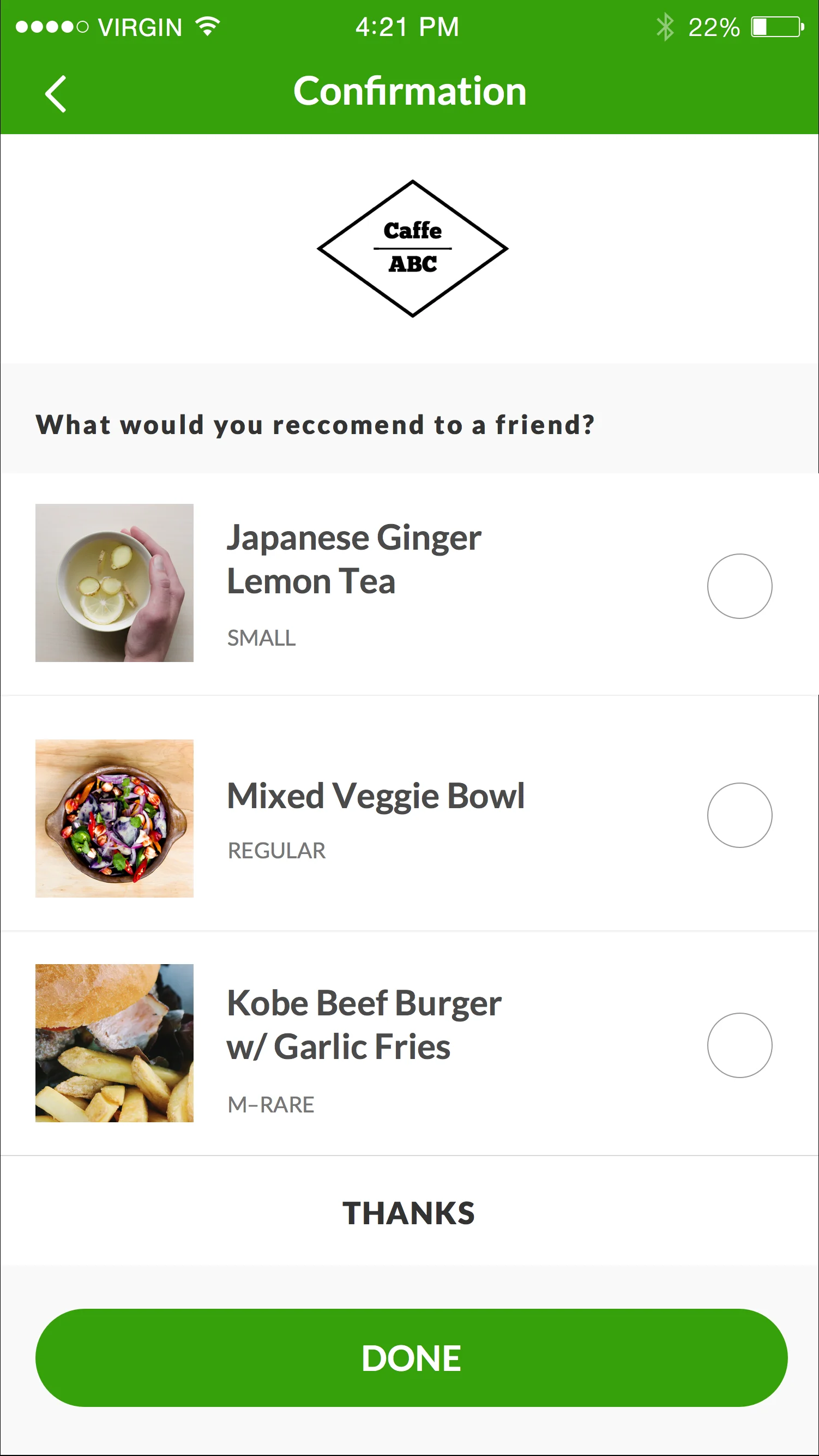
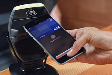
After my research, I decided that I should build a better version of yelp that would be more delightful so Tiffany might want to use it more – but my solution failed to be a way for her to remember to share food recommendations with her friends. So instead I decided to build something that wouldn't require Tiffany to remember anything at all and make food reviews a natural part of the payment process on a smartphone.
USER FLOW
Usability testing
After designing the higher level flow Tiffany would go through accomplish her goals (checking-in, reviewing food), I moved onto sketching and designing the specific interactions which would get her to those goals.
Approach: Sketch and test ideas as rapidly as possibly to validate or discourage directions for specific interactions.
I learned:
- That my flow could be more refined. I originally used Square Cash as a model for how I wanted my app for Tiffany to work. However, Square Cash is directed at users who are looking to pay one another a flexible price rather than having a restaurant dictate to a user what they are supposed to be paying. Thus I eliminated the numerical entry fields that would allow Tiffany to enter in what she wanted to pay manually. This allows the payment process to be far more directed towards paying her bill and getting to review the food she has just tasted.
- That more conventional UI lead to better understanding.
The flow I started with was much too long and complex for most users to feel intuitive the whole way through, but through multiple iterations, my solution became far more streamlined.
Digitizing
I moved on to creating a grayscale wireframe as well as a color mock-up and InVision prototype.