


The problem
As a part of an immersive design course at General Assembly, our first project was to interview a partner and find a problem to solve in their life with an app for one. Tiffany likes to explore new places & the cuisines they offer while keeping track of where she has been and what she liked to eat. However, she sometimes forgets to check-in or review restaurants during her busy day, making it harder for her to make informed food recommendations to her friends.
The Solution


I initially tried to solve this problem by creating a better Yelp!, but through paper prototyping and rapid ideation realize that she didn't need another system for her and her friends to join. So instead I created a way for Tiffany to quickly review food directly after paying for it on her smartphone – removing the onus on the user to remember to use yelp, and making it a natural part of the restaurant experience.
Please take a minute to follow my process below.
Details
TEAM
I worked by myself for 1 week on $end
Tools
- Pencil & Whiteboard Sketches
- Omnigraffle
- Sketch
- InVision
ROLE
Interviews, competitive analysis, scope, sketching, usability tests, iterations, visual design.

INterview
We were allotted 10 minutes for our interviews. In that time I tried to get Tiffany to talk as much as possible about the pain points she experiences in each activity we talked about to flush out issues that might be addressed through better design.
I learned: Tiffany really likes to adventure to new places around the bay area on the weekend to try new and exciting foods. However, oftentimes she and her friends forget to checkin or record their adventures, and they forget what to recommend.
Interview Ideation
After completing the interview, I visually sorted Tiffany's main activities into categories and then using spider diagraming, let my mind run free and tease out issues she faces with each.
I learned: Using free association and graphing Tiffany's main activities on a diagram helped to spark "what if?" solutions for her pain points that lead to a concise solution.
Problem Statements
After I had gathered information about Tiffany (persona) and putting her pain points into context, I went about defining the problem I was trying to solve.
Problem statement: Tiffany likes to explore new places, the cuisines they offer, and keep track of where she has been and what she liked to eat so she can share and browse the same information with her friends. However, she and her friends oftentimes forgets to check-in or review restaurants during her busy day.
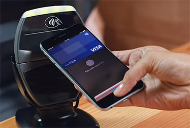
Solution hypothesis: Tiffany and her friends was forgetting to check-in and rate food because it is something that she was never prompted to do as a part of her restaurant experience. Why not try to integrate check-in's and reviews of food as a natural and integral part of the process of eating? If checking-in and reviewing food was accompanied by paying for her bill Tiffany and her friends would never forget to check-in again. I believe that combining the checkin/review process with mobile payments would solve this issue for Tiffany.

Competitive analysis
After analyzing and defining the problem, I sought out how others have tried to solve similar problems for inspiration. I looked at both the check-in and mobile payments space.


“I’ve failed over and over and over again in my life. And that is why I succeed.”
Where I failed
After my research, I decided that I should build a better version of yelp that would be more delightful so Tiffany might want to use it more – but my solution failed to be a way for her to remember to share food recommendations with her friends. So instead I decided to build something that wouldn't require Tiffany to remember anything at all and make food reviews a natural part of the payment process on a smartphone.
USER FLOW
In the ideal flow, Tiffany would finish her meal and decide to pay with $end, whose API would talk to the restaurant and her order would appear on her phone. Tiffany would use her thumb to confirm her payment, and would then simply tap on the items she liked, and her checkin and suggested dishes would be sent to Yelp to share with friends.
Usability testing
After designing the higher level flow Tiffany would go through accomplish her goals (checking-in, reviewing food), I moved onto sketching and designing the specific interactions which would get her to those goals.
Approach: Sketch and test ideas as rapidly as possibly to validate or discourage directions for specific interactions.
I learned:
- That my flow wasn't as streamlined as it could be. I originally used Square Cash as a model for how I wanted my app for Tiffany to work. However, Square Cash is directed at users who are looking to pay one another a flexible price rather than having a restaurant dictate to a user what they are supposed to be paying. Thus I eliminated the numerical entry fields that would allow Tiffany to enter in what she wanted to pay manually. This allows the payment process to be far more directed towards paying her bill and getting to review the food she has just tasted.
- I also streamlined the interactions at a smaller scale described and displayed in the images below.
The flow I started with was much too long and complex for most users to feel intuitive the whole way through, but through multiple iterations, my solution became far more streamlined.
Prototyping
on paper - POP app
Once I had refined the app through rapid prototyping and and incorporating user feedback, I used PopApp to digitize my pencil sketch wireframes so i could distribute my usability testing to a wider audience while remaining lo-fidelity.
The basic prototype can be seen here.
Digitizing
I moved on to creating a grayscale wireframe as well as a color mock-up and InVision prototype.