


THE Problem
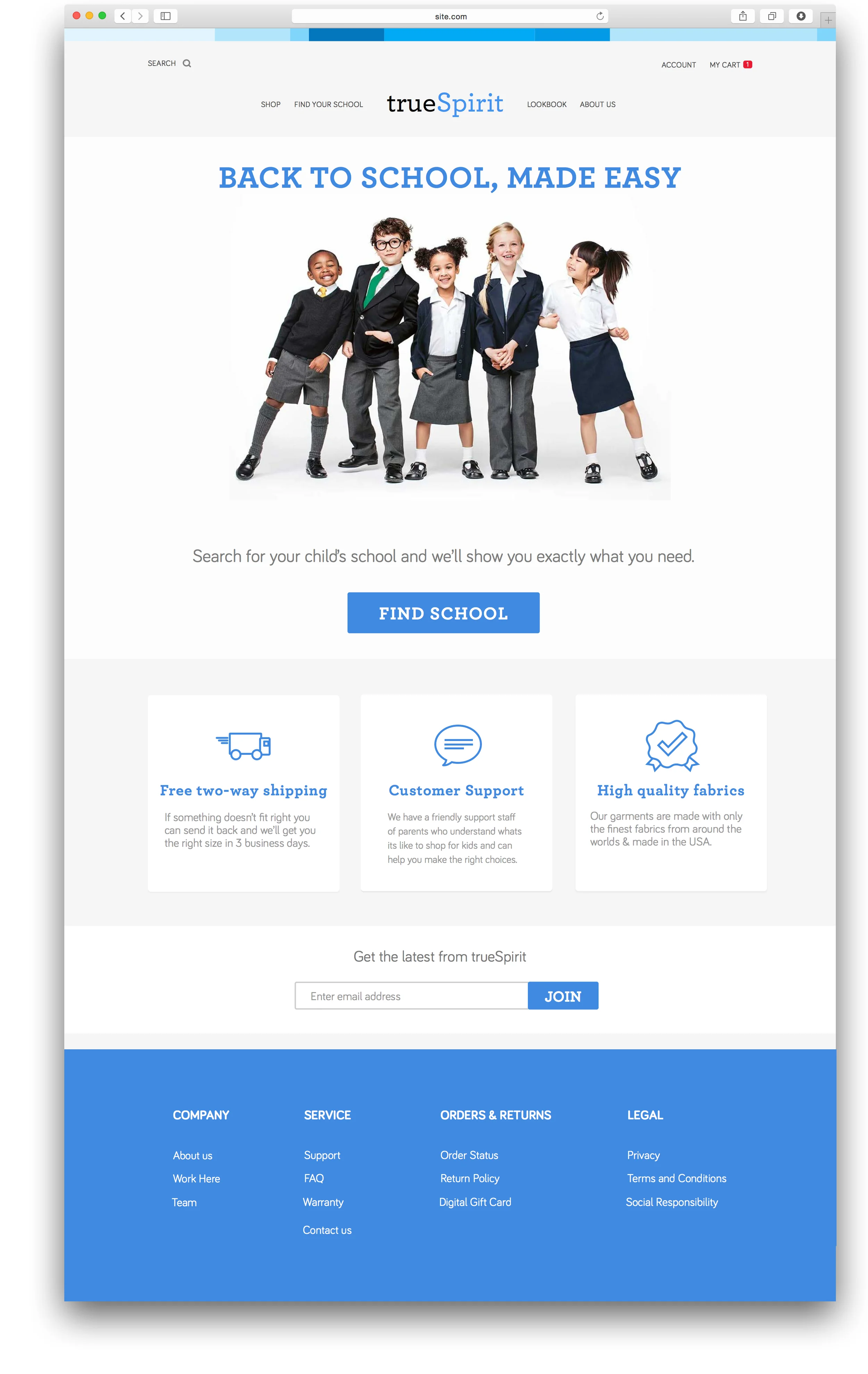
TrueSpirit is a new internet retailer for schools and parents who want a modern school uniform for K12 children. It offers updated uniform fashion including pants for girls and zip-up hoodies and recommends accessories allowed by the school’s dress code. Because it is an online only retailer, parents are unsure whether their clothes will fit, and whether they are buying the right things for their kids.
The Solution

I translated the abstract problems facing our provided personas and designed a checklist tool for parents shopping for school uniforms to increase their confidence that they are buying the right things and that their child will fit in. From my insights in testing, I also created a layout (with more breadcrumbs) for school administrators to efficiently and confidently set up their schools dress code and required items.
Please take a minute to follow my process below.
Details
TEAm
I spent two weeks by myself for this project.
Tools
- Pencil & whiteboard sketches
- Omnigraffle
- Sketch
- InVision
ROLE
Interviewer, UX design, visual design, user flows - whole project.

“
“If I had an hour to solve a problem I’d spend 55 minutes thinking about the problem and 5 minutes thinking about solutions.””
Personas
As a part of our project briefs, we were given personas that defined the goals and the concerns of the users we should be optimizing our designs for.
Take away: I highlighted the most critical aspects that would identify the problems our users had in common and made solutions to those pain points ("being sure of what i'm ordering") the pillars of my design (customized school shopping checklist).


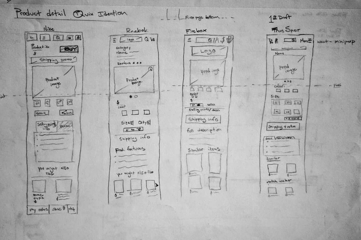
Competitive analysis
After analyzing what was most important to True Spirit's users, I looked at variety of (desktop and mobile) e-commerce sites and drew a skeleton for each.
Take away: Because my users were generally middle aged parents who were primarily concerned with being confident in their purchases, it was important to design a familiar and conventional site.
Desktop


Mobile
While designing the mobile page, I constantly reminded myself of the context of the interactions and used proper mobile heuristics to inform my layout.


Concept map
After defining the main goals and concerns of my Personas, I created a concept model to illustrate the relevant steps of the whole of the school uniform shopping experience from school administrator curation of items to parental purchase of uniforms.
User Flows
Below are the flow diagrams for the school administrator setting up their school's requirements, a parent receiving an email from the school and going through the school's customized page and a parent entering TrueSpirit.com to buy a few basic items for his daughter.
Take away: The user flows validated my logic and the efficiency of the site and acted as a checklist of all of the screens to sketch for testing.
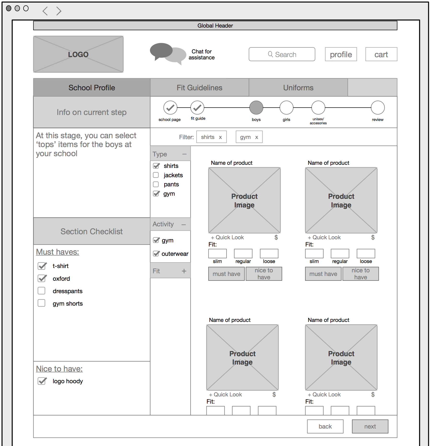
Admin User flow
When built, True Spirit would to have an API that would allow the school to send True Spirit the first name, gender and grade of the kids in a class so that when the parent receives a True Spirit email, their kid's checklist already populated with the appropriate checklist – rather than having a parent have to manually enter the data about their kid.
IDEAL PARENT USER FLOW
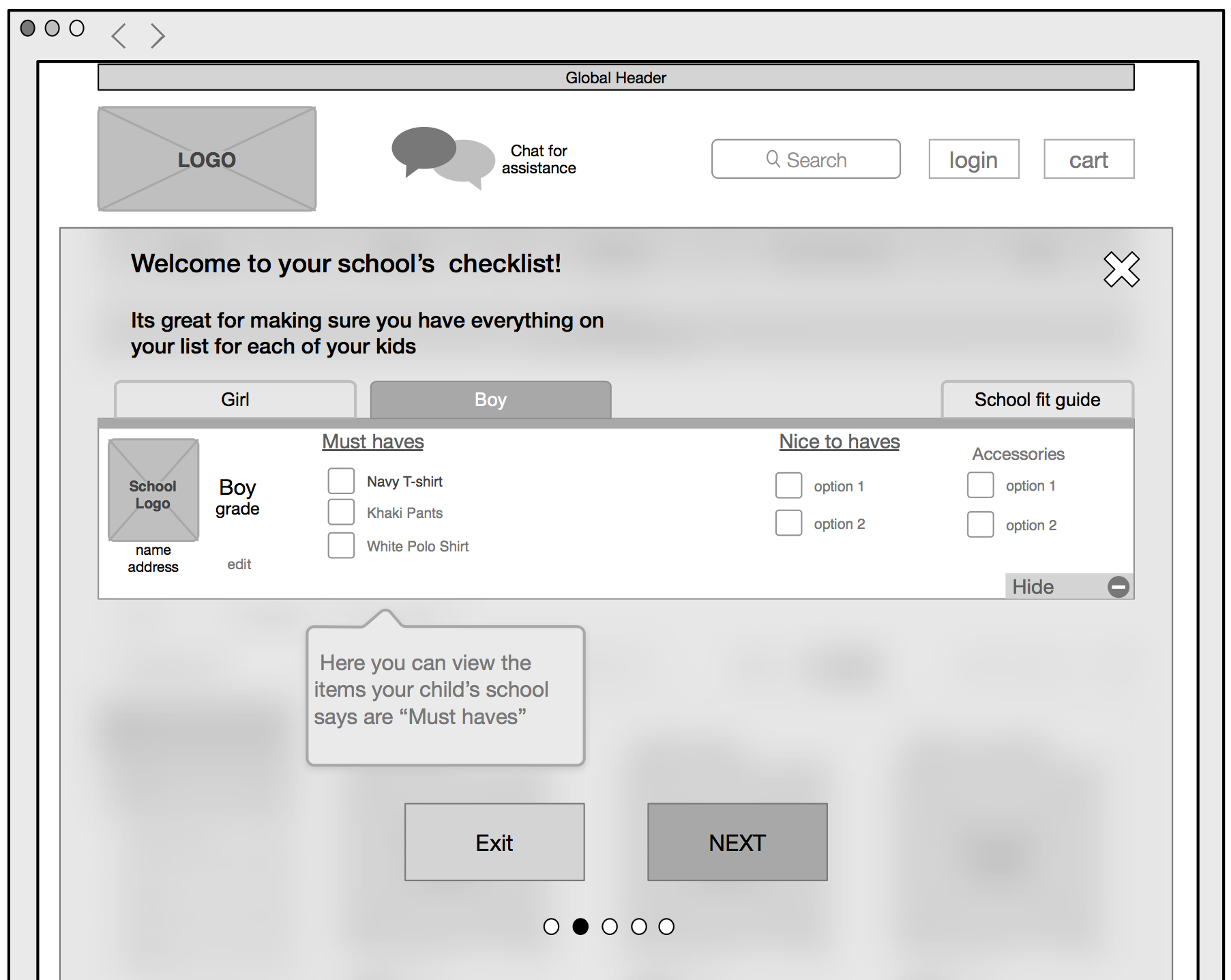
When a parent clicks a link in the email from the school about school uniforms, they arrive at a customized school specific page on TrueSpirit.com which shows them a checklist with the must have and nice to have items outlined by the school's admin. From there, they can make sure they have all of the items they need to buy, and check out smoothly.
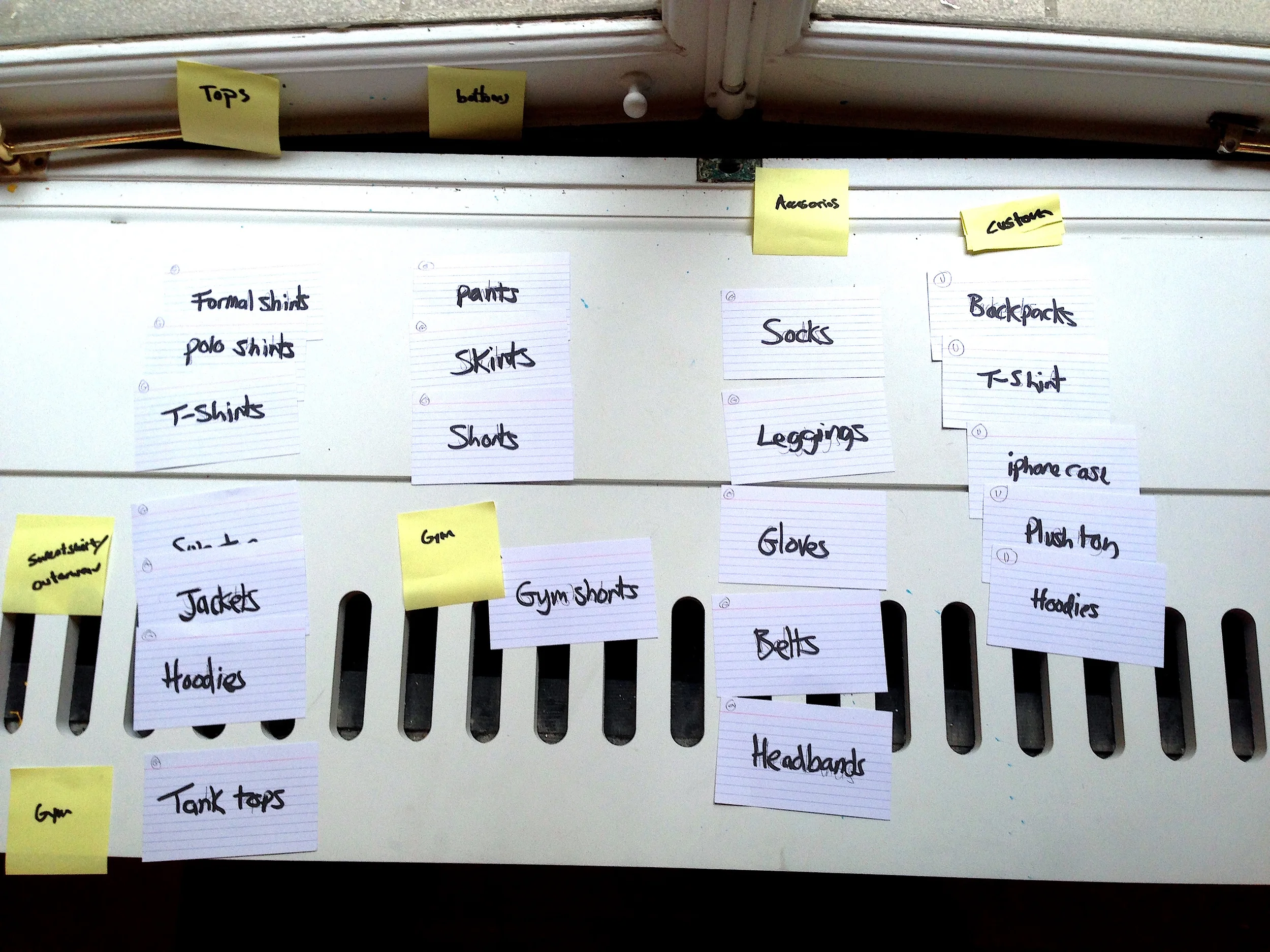
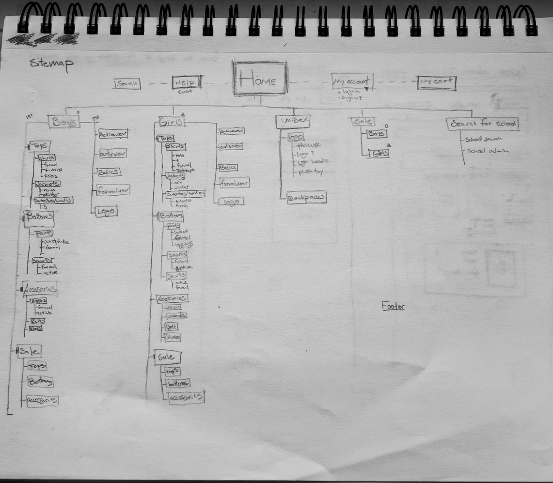
INFORMATION ARCHITECTURE & SITEMAP
After getting an idea for the user flow for the site, I used a card sort on multiple participants to guide the sitemap and information architecture for the site.

“The details are not the details. They make the design.”
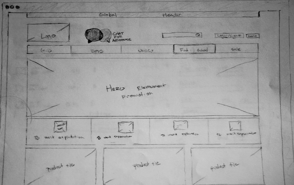
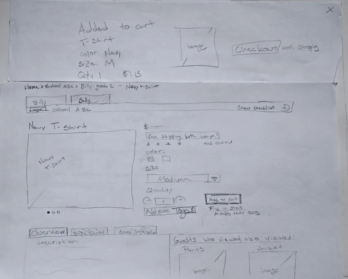
Sketches
Armed with the all of the elements I wanted to include and how to structure them, I began sketching wireframes to conduct wizard of oz testing (my favorite lo-fi design tool) with users. Again, because my target users are generally middle aged parents who are primarily concerned with being confident in their purchases, it was important to design a familiar and conventional site. Therefore I was hesitant to incorporate new features like the checklist for school must haves.
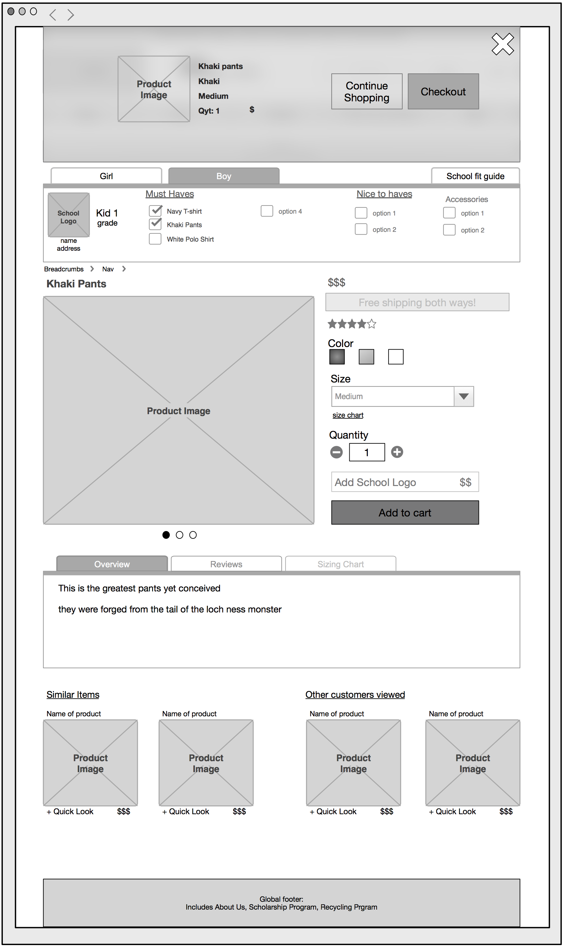
From left to right: Homepage and header, category shopping page with checklist feature, product detail with product added to cart.

Paper Prototype testing
I LEARNED THAT...
The new checklist feature wasn't immediately clear to users.
- To solve this I decided to include a first run tutorial (which you can view in the InVision prototype) that cleared things up immensely.
AND THAT...
School administrators would have even more problems if they were presented with the same feature (i.e. choosing all of the parameters for school uniforms for each grade and gender).
- To solve this, I designed a more robust school administrator setup page with persistent step by step guidance to make the process clearer.
My checkout
I decided to go flat-skumorphic for the billing entry field and have the credit card act as a form.
Digitized Prototype + more testing
After doing the bulk of my concept testing, it was time to digitize in Omnigraffle, and set up a basic prototype in InVision which can be viewed below.