


Family Locator is about achieving peace of mind for the people that matter most. With version 2.0, I led the vision for an aggressive redesign that is the backbone of the platforms two-year roadmap.
The Problem
Family Locator is a tier-1 carrier family location service that allows parents to find their family members in case of emergency, to coordinate family logistics, and receive regular location updates via SMS (all without the need to install an app). Our key demographic are parents with kids 8-17. After months of research, we categorized these parents into different personas – "Schedulers", "Controllers" & "Just-in-case" users.
While Family Locator saw initial success at it's launch in 2009, emerging technologies and shifting consumer expectations meant that we needed to redesign our platform to compete in 2017 for Sprint, AT&T and T-Mobile.
Goals
Design
Reframe existing features using new design principles born from user insights to improve features adoption and boost 1 month retention.
Create an extensible platform for future development to win new contracts with more carrier partners around the world.
Modernize the UI to optimize for new features that utilize new technologies.
Business
Win over our carrier partners with an enticing future vision for the product.
Maintain and grow the user base with new value in the product.
Improve retention & LTV
Role
Lead designer on a 25 person team performing – needfinding, product roadmap prioritization with PMs, wireframing, UI, prototyping, usability, copywriting and some visual design.
Summary
In home interviews, diving into analytics, and collecting survey data suggested that we needed to update our assumptions the product team was making about our 3 personas we design for. By creating journies for each persona, we were able to understand the details of each of our persona's journeys that needed improvement & build empathy for our users across the engineering and product teams. Through our efforts we brought more value to all parents by adding robust new features, contextualizing existing features to increase their usability & adoption, and by creating a more extensible UI framework that simplified integration of new features in the product roadmap. All while balancing an aggressive timeline, getting carrier buy in and validating our most critical assumptions along the way.
Know thy user, everything else follows
Safety is always #1 – parents are constantly on high alert about the safety of their child. Gaining trust to aleviate some worry is have a powerful retention tool.
Parents didn't mind if their kids could see their location – revealing this uncovered new use cases (temporary sharing, pickups, parents leaving work).
Kids were okay with being located (somtimes) – we found that kids were on board with their parents locating them in certain circumstances. Framing the app to kids as a safety tool impacted on how they felt about their parents using it.

Defining use cases from parents needs, data and competitive analysics
Location/communication – To satiate the immediate needs of parents. "Where is my kid?" "Oh they are there? I should get in touch with them"
Rules (location alerts, curfew, personal assistant) – Parents really liked framing our additional features as rules and they helped us generate new use cases.
Safety (panic button, safe zone) – Safety is always at the top of parents minds. For their immediate concerns, they can locate their kids, but having additional, hands off protections also resonated with parents.
Defining principles to drive the roadmap and deliver better solutions
I incorporated usability feedback, Amplitude data, and journey map analysis, I formulated four design principles to guide our redesign & get the most out of our current product offering without increasing the scope of the (highly constrained) engineering effort.
- Contextual (offer stories instead of tools) – e.g. V1 had "geofences" & "scheduled check ins"... V2 would instead ask users to set a Curfew for their kids. By adding context, we removed the "how can I use this feature?" moment for parents.
- Robust (feel deep and powerful) – Research showed that users said our app was simply about location, so we changed the navigation structure to reflect our values (mentioned above) and to help users understand the categories of value they got.
- Extensible (flexibility for the product to grow into) – By abstracting our features into higher level categories, and by using a far more modular UI model, we set the foundation for a platform that could support new use cases over time.
- Focus on first week – Digging into the Amplitude data, and observing industry trends that suggest most apps lose about 80% of their users in the first few days after sign up, we focussed our efforts on getting users to set up a feature that would trigger their return to the app.
Prototyping for interaction, usability and communication
- Concept validation & usability testing – We did multiple sessions from hand drawn sketches to high fidelity prototypes (right) to tease out issues in our UI in Emeryville an Kansas city for existing Sprint customers.
- Communication – After every testing session we'd ask people to describe the app to a friend as a proxy for if they understood the value they'd get from it.
- UI design for older users – Because our users are generally over 40, legibility and navigation are always big concerns to test multiple times. Through a couple of iterations we were able to find the right sizing for most users.
Getting it built
Building a component library – As the first major project I'd led, I learned a lot about what it takes to communicate and document designs effectively. Through the process, I settled on a creating "annotated" wireframes along with the component library.
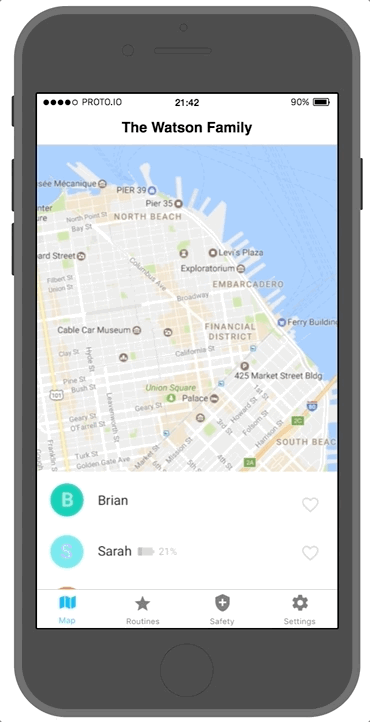
Prototyping for communication – I used Proto.io to communicate animations and transitions.
Overcoming engineering blocks – I also facilitated communication between our engineering teams (front and backend) and worked with engineers to find iterative solutions when technical challenges arose that might compromise the user experience.
Results
I would love to demonstrate the success of the product in the market, the product in this form never entered the market. However, one month before launch, Sprint's new executive fired the product team that handled our contract and made an agreement with a different vendor with whom he had previously worked with.
This was a big blow to me and the team... but the foundations of the work we did was fed into the revamping of our other core product - Verizon Smart Family which has 1.7m happy subscribers. In the process I learned a few important lessons.
- Simplify whenever possible - Complexity increases the time it takes to achieve results, and weighing where you can make the product simpler to start, without sacrificing too much UX, means you have more time in the market to learn.
- Fight for good enough - While there were forces out of my control which meant this product never actually hit the market... moving faster with good enough would have let us iterate more over time, and get momentum with Sprint.
Toughest design challenges
The toughest aspect of this project was how to balance our competitive advantage being integrated with the carrier and getting network triangulated locates (lower accuracy) and GPS locates (higher accuracy) from the client. Network locates work immediately – allowing our users to see value on their first use, instead of having to install something on their kids phones. However, we also wanted to leverage the capabilities of higher and more frequent locates to make new and interesting features. Some tough questions emerge:
Do you want the user to know the difference between these types of location?
While it's simpler to think that all of your users want as many features as they can get - not all want to go through the trouble. There is also a difficult tension between telling a use to get everything out of the product vs. causing a user to feel like they are missing out on features and paying too much.
Will users be able to understand a completely different UI?
